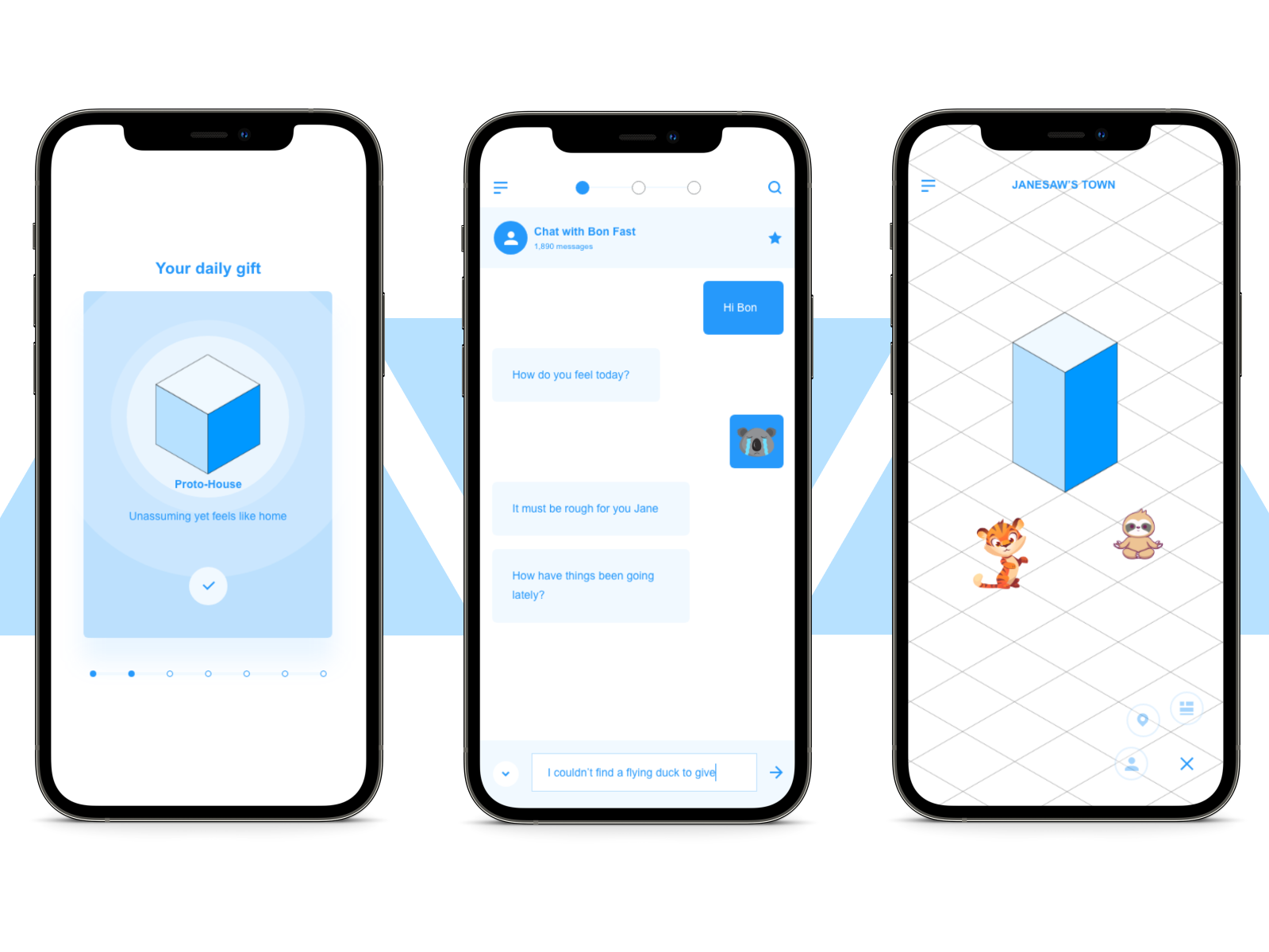
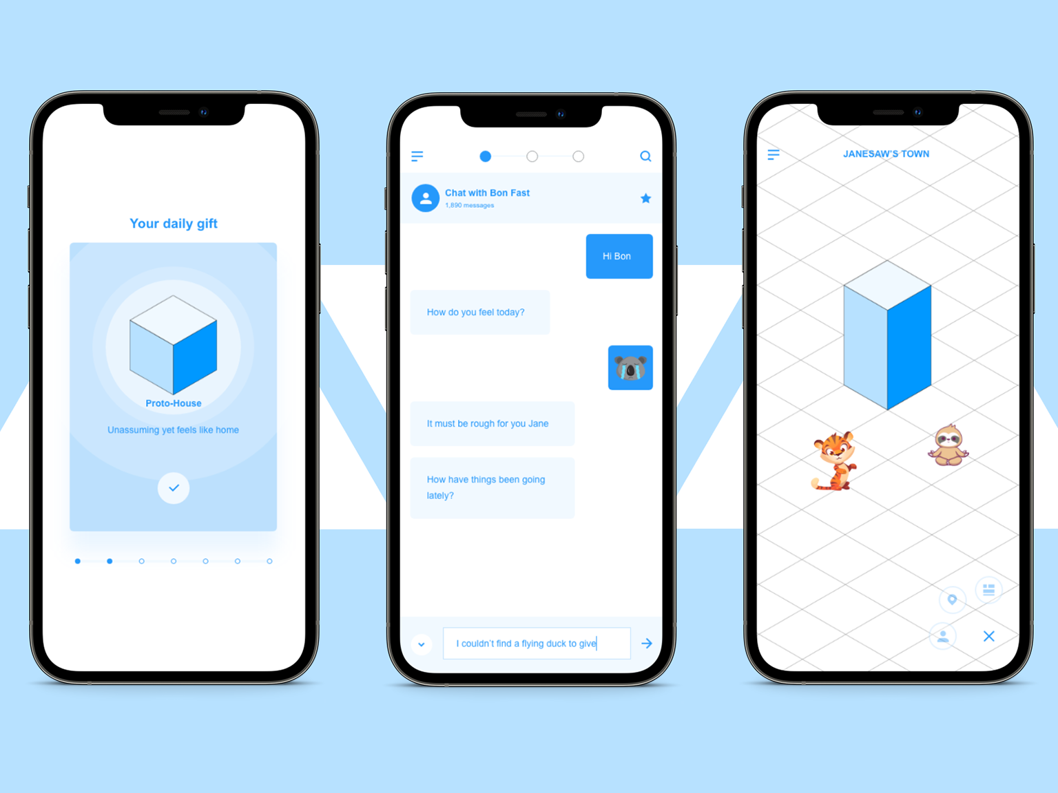
Overview
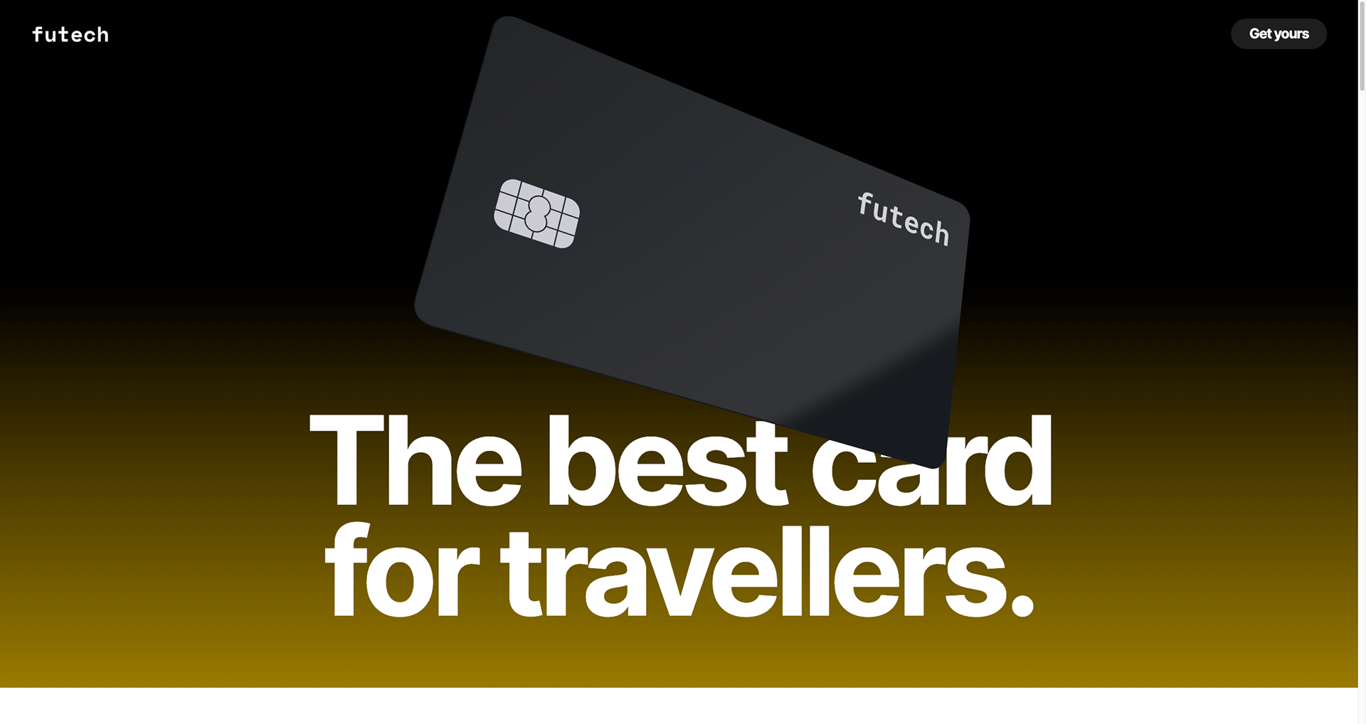
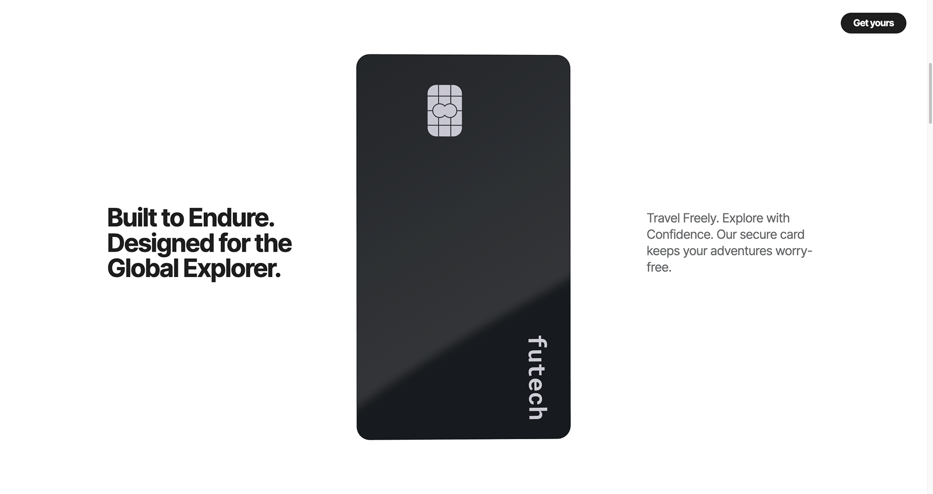
This landing page concept explores the possibilities of 3D web design in crafting a more engaging user experience. Here, we showcase an interactive 3D bank card as the centerpiece, allowing users to explore its aesthetics in a dynamic and immersive way.
The result highlights the interactive card's features and, ultimately, demonstrates how this approach can lead to a more user-friendly and captivating online experience.
Live website
For the development phase, we went ahead with Webflow. Here is the link to the live site:


Project duration
4 weeks including research, design, and development
Team member + Roles
Terry (me) - research | design | project management
Nghia - research | design
Tools
Figma | Spline | Webflow | Framer | Dora | Miro
Experimentation
We first create a fictional bank offering a travel-oriented card that allows the users to roam the world worry-free. Paper wireframes, digital wireframes, and mocks were quickly designed.
After (many) rounds of desk research, we opted for Spline as the primary 3D design tool. This selection caters to the varying levels of 3D design experience within our team, ensuring a smooth workflow. Additionally, Spline is mainly purposed as a 3D tool for web design which allows us to move past the hurdles of optimizing the 3D models when using Blender.
The initial design goes with Dora which lacks the responsive factor.
In the 2nd iteration, we acknowledge the current limitations of 3D web experiences, particularly the lack of touch gesture recognition on mobile devices. To address this, our team experimented with various no-code development and advanced prototyping tools like Webflow, Dora, and Framer to explore potential workarounds for mobile user interaction... They all have the same above problem. Therefore, the 3D element on the mobile breakpoint acts similar to a normal video, albeit loads much slower.
After the 3rd iteration, we discover inspiration from the Webflow Template library that makes the 3D web fully responsive by sacrificing the interactive element. We start focusing on making scroll animation instead which takes us back to the 1st iteration. The result is a comprehensive 3D web app that can be a case study for future projects.
3D Model
1st iteration: Dora experiment
2nd iteration: Fully-interactive card
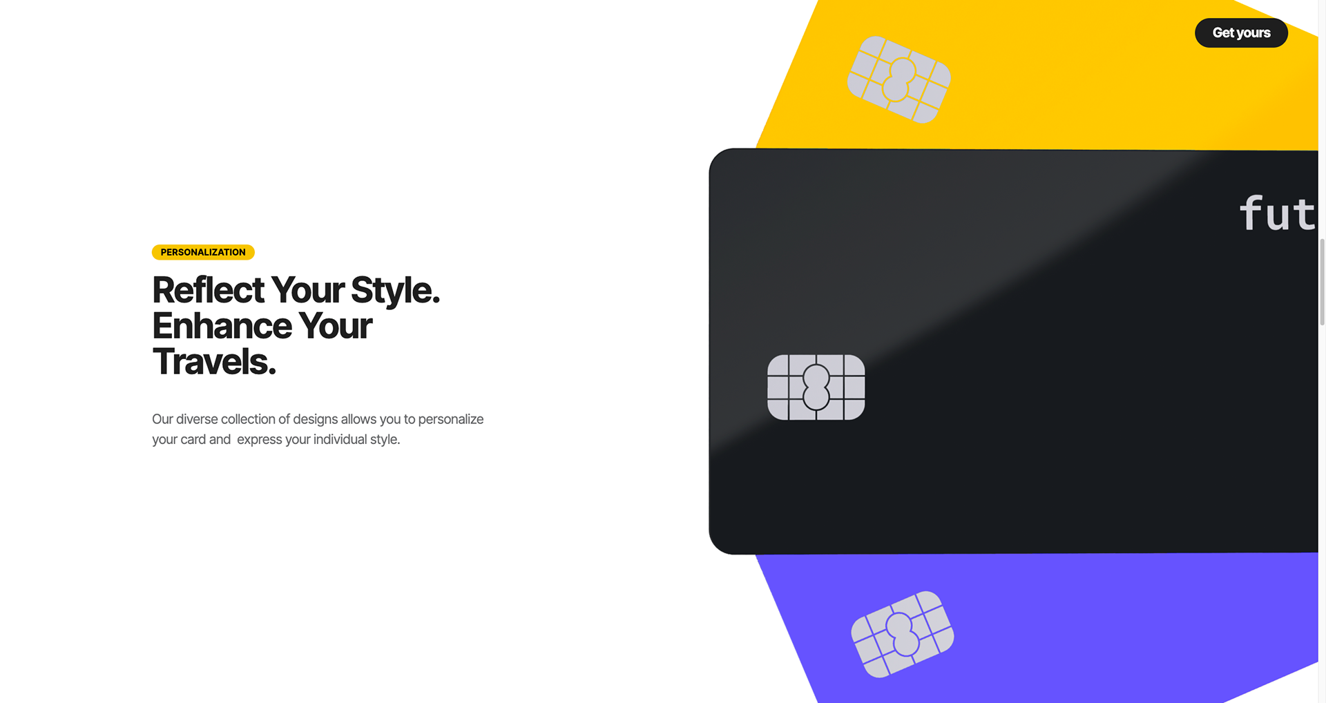
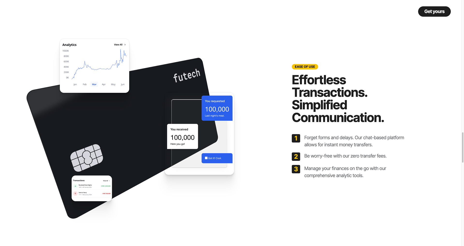
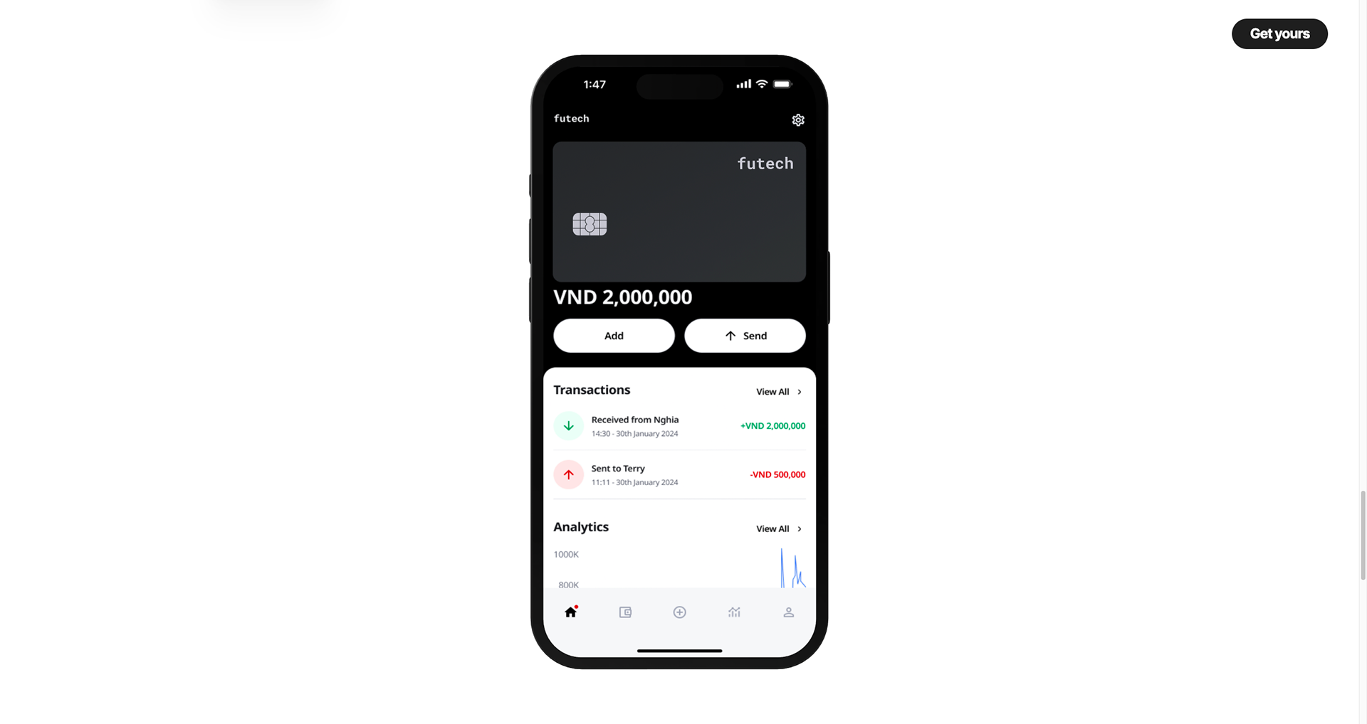
3rd iteration: Semi-interactive scrolling web
Key takeaways
- Spline's Accessibility: Utilizing Spline proved effective for teams with varying 3D design experience, facilitating a streamlined development process.
- Mobile Interaction Hurdles: The current lack of touch gesture recognition in 3D web experiences presents a significant challenge for mobile user engagement and mobile-first design approach.
Next steps
Stay updated & explore for more!
