Visit the website
Overview
The primary goal for FELIC.studio's website was to effectively showcase the production house's capabilities and expertise, making a compelling case to potential clients about why FELIC.studio is their ideal choice.
Team members + Roles
Terry (me) - research | UX design | UI design | project management | no-code web development
Tools
Adobe XD | Miro | AI image generator (Stable Diffusion | Adobe Firefly)
UX animation design prototyping
Research
Qualitative
After the initial foundational research, user research was conducted through interviews to dive deep into the needs, preferences, and pain points of our target audience. 12 people were selected for this process.
Research insights
- Visual and more visual: Our audience sought a portfolio that displayed versatility and resonated with the latest trends and their specific needs.
- Reliability: The potential clients looked for evidence of innovation and a track record of high-quality work that could translate their vision into compelling visual content.
- Visibility of contact information: Actions taken by users included actively searching for portfolios and contacting information. They were involved in pitching processes and often needed to review selections and negotiate contracts.
Competitive audit
A competitive audit of 10 rival production houses was conducted to benchmark FELIC.studio against industry UX standards and best practices. The findings informed our design and development strategy in the following ways:
- Mobile-First: In response to the widespread lack of mobile optimization among some competitors, we prioritized a mobile-first design approach.
- Accessibility: With the understanding that accessibility was a common oversight, We ensure adequate color contrast, text size, and provide alternative text for images.
Journey map
Scenario
Information Architecture
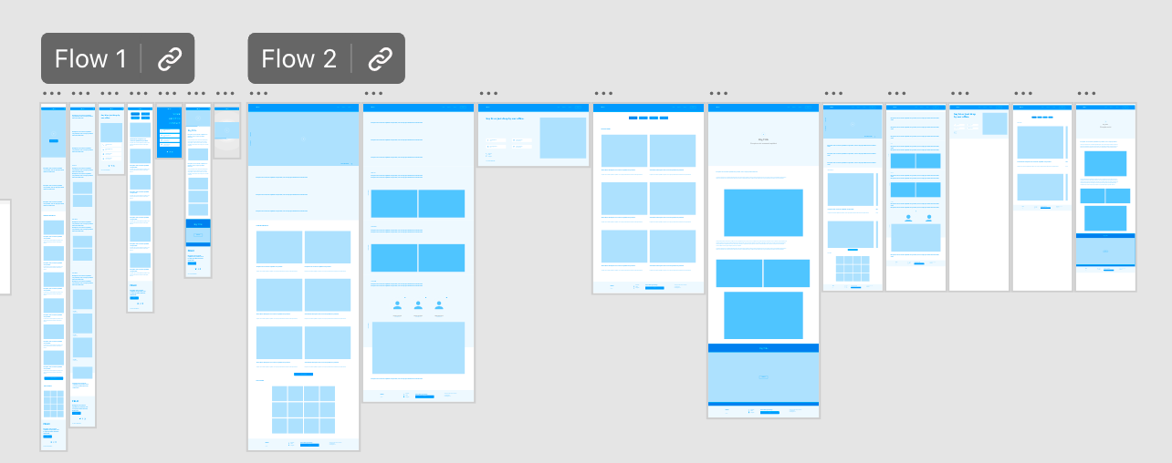
From wireframe to hi-fi prototype

User interface
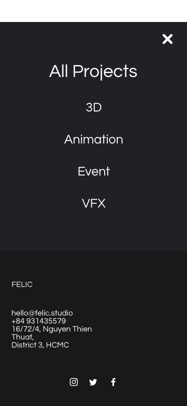
The UI design follows minimalist principles to keep the website clean and modern.


Evaluation
- User Feedback Sessions: We conducted feedback sessions where users engaged with our hi-fi prototypes. Our focus was on both the usability of the interface and the emotional responses elicited by the design.
- First Iteration -> Second Iteration -> Final Design
- First Iteration -> Second Iteration -> Final Design
Feedback from users has been overwhelmingly positive, particularly in regards to the seamless experience provided by the responsive design and the engaging nature of the motion graphics. Clients and visitors have expressed appreciation for the visual storytelling and the professional representation of FELIC.studio brand identity through dynamic and interactive elements.
Lessons Learned
The project underscored the importance of user research in informing design decisions and the value of iterative design and usability testing in creating an effective user experience. It also demonstrated the effectiveness of using a no-code platform for rapid development without compromising on design quality.
Future Directions
Plans for future iterations include: creating an interactive 3D splash screen, integrating more interactive case studies, and enhancing the portfolio section with more detailed project breakdowns.
