Overview
As part of a partnership between ONE Esports and Samsung, this pre-installed app was designed to give Samsung users direct access to esports news, event sign-ups, and exclusive promotions. On paper, it sounded straightforward. In practice, the app struggled with high drop-off during onboarding, low retention, and felt too similar to the web experience. On top of that, the lack of standout features and inconsistent design language made it hard to justify its existence as a native app.
Goal
This project was about rethinking the app’s core experience: identifying what users needed on mobile, aligning design with ONE Esports’ brand, and creating real value that couldn’t be replicated on the web.
Team
Terry (me) - product design
Derek - product management
Le Duc - research | product analysis
Dale - UI and graphic design
Tools
Figma | Miro | Photoshop | Illustrator
Insight
The app accounts for 20% of ONE's total users.
After analyzing user data and feedback, several key issues surfaced. The app experienced a high drop-off rate during onboarding, with many users not making it past the first few screens. Retention was equally low, pointing to a lack of compelling reasons for users to return.
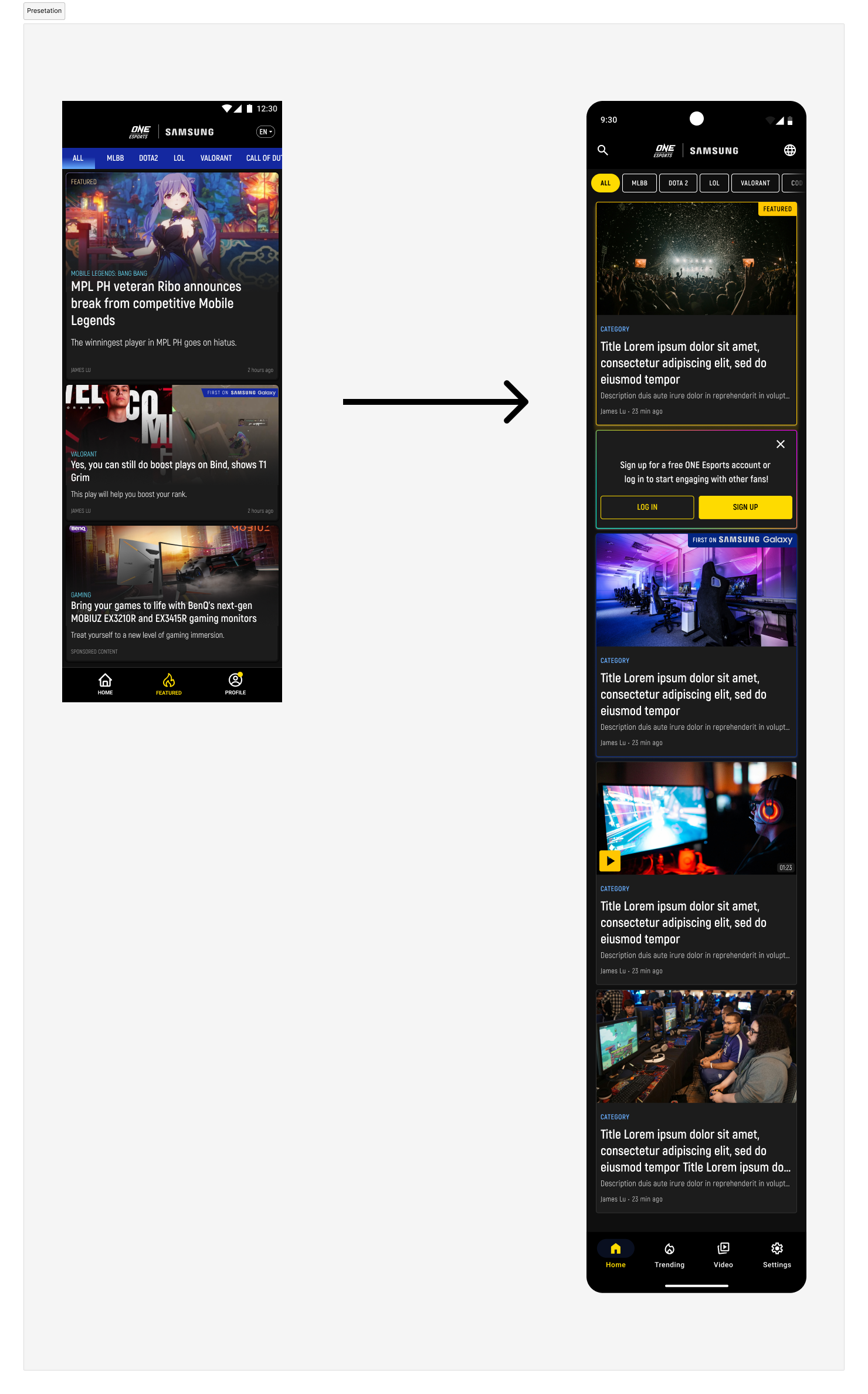
Feature-wise, the app didn’t offer much beyond what was already available on the ONE Esports website. As a result, The design also felt disconnected, visual inconsistencies between the app and the web created a fragmented brand experience that further discouraged app adoption.
These insights highlighted a critical need to redefine the app’s value, streamline the onboarding flow, and close the gap between mobile and web experiences, both functionally and visually.
Strategy
To turn the app into a meaningful touchpoint for ONE Esports users, we needed to move beyond basic fixes and rethink the experience from the ground up. The strategy centered on designing for real user needs, making the app faster, more engaging, and worth opening daily.
Here’s how I approached it:
• Accessibility first: Optimize for mobile performance with faster load times and a smoother experience. The goal was to make the app feel seamless from the moment it launches.
• Lean into personalization: Implement a recommendation engine, tiered content structure, and gamification to surface relevant content and reward repeat engagement.
• Tighten usability: Localize content to key markets and unify the design language across app and web to build trust and familiarity, while still delivering a native mobile experience.
The strategy was simple: build something users want to come back to—not just because it’s pre-installed, but because it adds value.
To tackle the app’s core challenges, I rolled out an iterative strategy across three phases, each designed to solve specific user pain points while laying the groundwork for long-term growth.
Phase 1 - Fix the basics
We started by addressing the onboarding drop-off. Visual updates were made to simplify the flow, and tracking tools like Hotjar and Crazy Egg were integrated into surface friction points. This phase also focused on establishing a design system with reusable variables to improve consistency and speed up future iterations.
Phase 2 - Build engagement
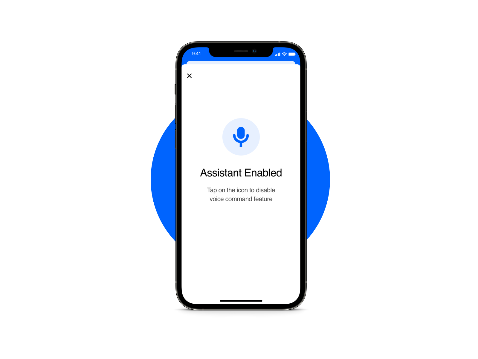
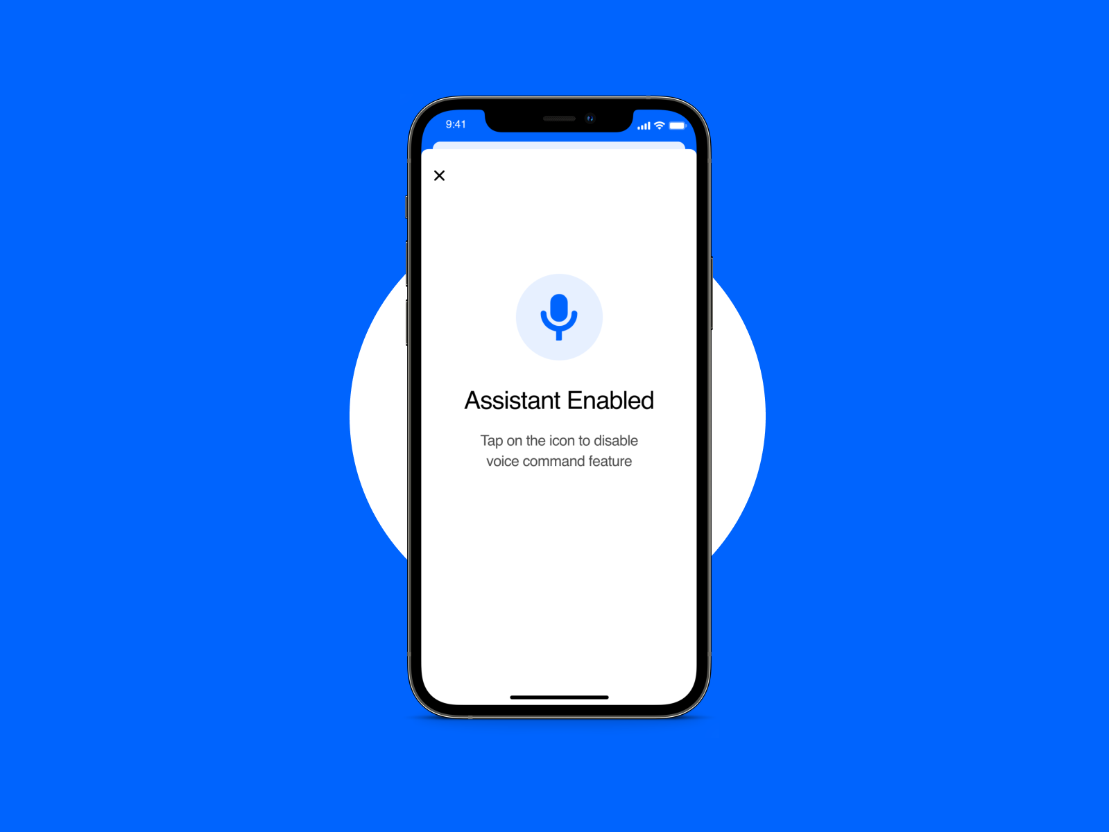
With the basics in place, the next step was retention. We introduced personalization features and explored AI-powered speech-to-text for accessibility and convenience. The design system continued to evolve to support these new features seamlessly.
Phase 3 - Deliver long-term value
Finally, we looked at deeper engagement. This involved revamping the login system, enhancing search capabilities, and mapping out a gamification strategy. Ongoing user research guided the roadmap for future features, ensuring we stayed aligned with what users wanted.
Presentation
High-level roadmap
Personas + User journey maps
We have 3 main personas: Esports Fanatics (main target audience for phase 1), casual gamers, newcomers
Pain points:
• The app didn’t offer exclusive content or real-time updates, making it feel redundant.
• Sluggish performance during key events frustrated users who wanted instant access.
• Without content recommendations, users struggled to navigate or discover relevant stories.
• Inconsistent visuals and basic features made the app feel less polished and not worth revisiting.
• The onboarding lacked guidance, overwhelming new users with a wall of content.
• Without personalization or a hook, users quickly lost interest and didn’t return.
Wireframe
Working remotely, I facilitated a brainstorming workshop on Miro with junior designers to kickstart the wireframing process. The goal was to generate quick ideas, identify potential solutions for onboarding and content discovery, and align on the app’s core flows.
We focused on low-fidelity wireframes to explore layout, hierarchy, and feature placement without getting bogged down in visuals too early.
Onboarding screen workshop
Video page workshop
Onboarding flow redesign
The original onboarding was long and intrusive—asking users to sign up before they had any context or reason to stay. After a competitive analysis of similar content-driven apps like BBC, New York Times, CNN, Al Jazeera, and IGN, a pattern emerged: apps offering free content minimized onboarding friction, while premium subscription apps leaned into more extensive flows. ONE Esports fell into the first category, but our onboarding didn’t reflect that.
I proposed a shift: remove all onboarding screens and instead let users dive straight into the home screen. To guide first-time users, I added tip bubbles, small, contextual nudges explaining key actions like changing language and managing notifications. This approach gave users control and allowed the content to speak for itself. This onboarding approach is also backed by NNGroup.
There were constraints. The product manager wanted to keep onboarding to showcase value since the app was pre-installed, while the CEO pushed for mandatory sign-up prompts for user data collection.
We reached a compromise:
• A light landing screen was kept for value proposition only, no hard barriers.
• The sign-up prompt became a card that blended into the home feed, triggered every 3 visits, instead of blocking the experience.
We ran A/B tests:
• Variant A with onboarding screens + tips.
• Variant B without onboarding screens, tips only.
Onboarding flow redesign
Extract form Status Report
Onboarding tutorial + sign up card
Design system
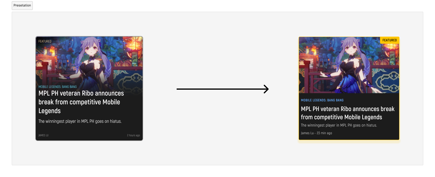
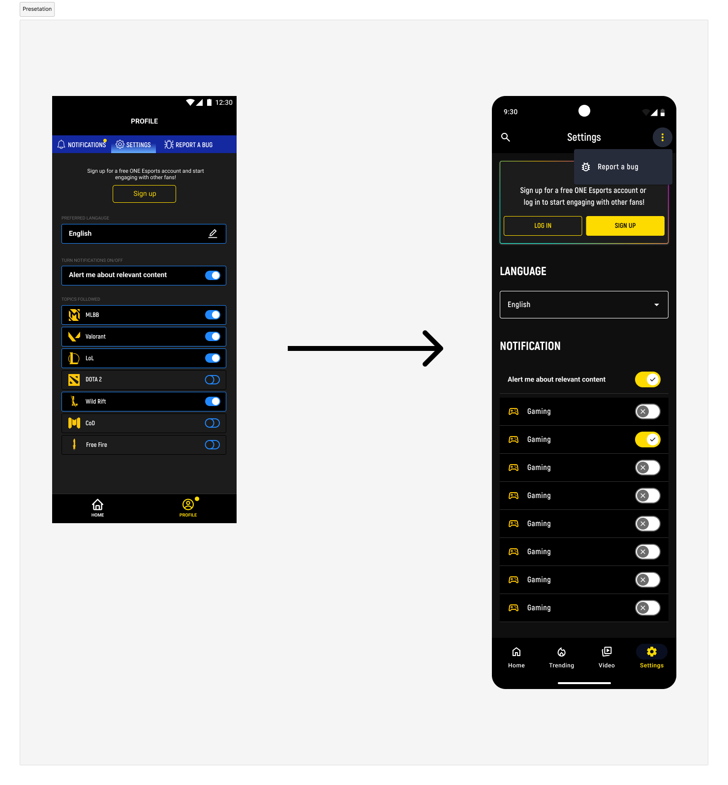
To streamline development and ensure visual consistency, I created a modified version of Google’s Material Design 3 (M3) tailored for this project. The goal was to move quickly without sacrificing quality and ensure the app felt native to Android, which was especially important since it was pre-installed on Samsung devices.
This custom system served a few key purposes:
• Consistency: Unified styles, components, and interactions across screens to eliminate the visual disconnect between the app and the web while offering a more distinct look for the app (Material Design vs Brutalist).
• Development-friendly: Optimized for ReactJS, which was the framework used by our mobile developers, making handoff smoother and implementation faster.
• Android-native look: Leveraged familiar Material patterns so users instantly recognized the app as native, not a web wrapper.
By building on M3, I avoided reinventing the wheel while still having the flexibility to adapt components to ONE Esports’ brand and specific user needs. It helped us scale updates quickly and laid a solid foundation for future feature rollouts.



Prototype
Key takeaways
This project was a solid reminder that good UX isn’t just about design, it’s about negotiation. Balancing user needs with business goals required clear communication, flexibility, and a willingness to test and adapt.
A few things I walked away with:
• Less is more in onboarding: Letting users experience the product first, and earn their engagement, can drive better retention than forcing sign-ups upfront.
• Design systems save time and sanity: Leveraging Material M3 with custom tweaks helped maintain consistency and speed up development.
• Collaboration matters: Running workshops with junior designers and aligning with stakeholders across product and leadership taught me how to guide teams while staying open to feedback.
• A/B testing is your best friend: It turned subjective debates into data-driven decisions, helping us find common ground without compromising user experience.
Next steps
This case study highlights the foundation we built in Phase 1, reducing onboarding drop-off, unifying visuals, and setting up tracking to understand user behavior. With that groundwork in place, the focus shifts to Phase 2 and 3, where we scale value and deepen engagement. Here’s what’s next:
• Retention features: Roll out personalization tools like content recommendations and localized feeds to keep users coming back.
• AI integration: Explore speech-to-text for accessibility and real-time updates, adding functionality that feels smart and useful.
• Gamification strategy: Design light engagement loops (badges, rewards, progression) to incentivize regular use without overwhelming casual users.
• Login system revamp: Make account creation seamless and more rewarding, with clear benefits and minimal friction.
• Continuous research: Run targeted user interviews and surveys to validate new features and uncover additional needs.
