Overview
The goal of the project was to create a versatile and secure wedding photo-sharing platform that simplifies the process for all involved parties. We aimed to enhance user engagement and satisfaction by offering intuitive features and a seamless user experience.
Team member + Roles
Terry (me) - UX design | UI design | research
Tools
Figma | Miro
Research
Qualitative
Interviews were conducted with a diverse group of users to gather qualitative insights into their experiences and expectations from a photo-sharing platform.
Insights
- Ease of Use and Quick Sharing: Confirmed as fundamental expectations among all user groups, emphasizing the need for an intuitive and efficient platform.
- Privacy Concerns: Emerged as a critical consideration, with users expressing the need for control over their shared content and who has access to it.
Persona + Journey map


Initial overall sitemap
Initial user flow
Paper wireframe -> Digital wireframe -> Lo-fi prototype


Hi-fi prototype
UI stuff
--To be updated--


Hybrid Solution
QR code and 6-digit code stickers are placed at the venue where the ceremony happens. This will ensure the users have various methods to securely log in to the right gallery.
Evaluation
Testing Methodology
- High-Fidelity Prototype enabled participants to engage with the platform realistically, providing valuable insights into the user experience.
- Participants were selected to participate in the testing sessions, ensuring the guest-specific use case was covered.
- Tasks: uploading photos.
- Metrics: The primary metric for evaluation was the task success rate. Additional qualitative feedback was gathered to gain insights into user satisfaction and areas for improvement.
Evaluation results
- Task Success Rate: The testing sessions revealed a high task success rate.
- User Feedback: Participants expressed satisfaction with the platform's ease of use, and the intuitiveness of the photo-sharing process.
Accessibility
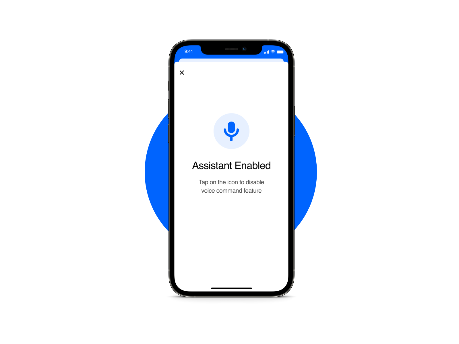
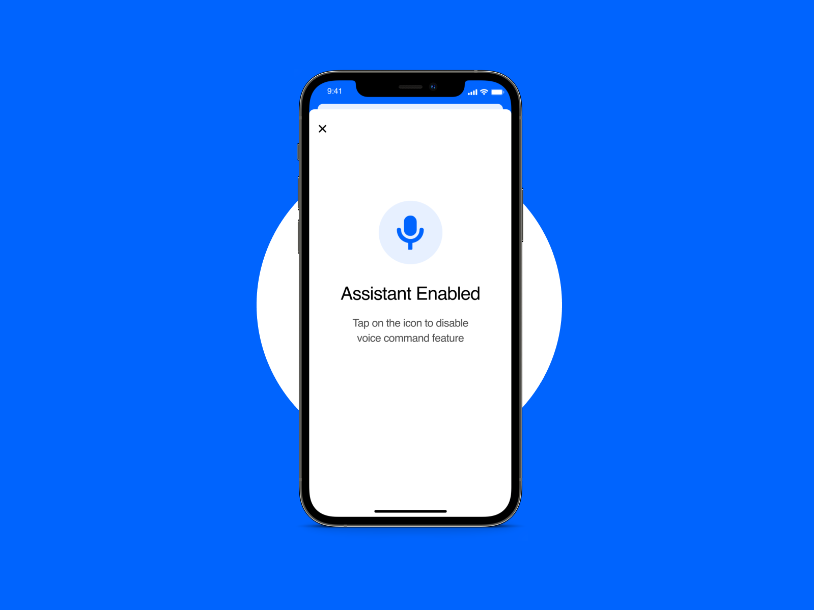
- Voice-Over Capabilities: we integrated voice-over capabilities to assist users with visual or cognitive disabilities in navigating the platform more easily.
Impact
The design has received overwhelmingly positive feedback for its user-centric approach and accessibility features.
What I learned
Throughout this project, I gained valuable insights into the importance of user-centric design and the role of iterative testing in refining the user experience. I also learned how to effectively address diverse user needs, from wedding planners to guests, while maintaining a cohesive and intuitive interface on a single platform.
What's next
- Feature Expansion: The next step would be to create different flows for other types of users. Also, adding social sharing options or integrating with existing photo storage services could enhance user engagement.
- Localization: Given the universal appeal of weddings, localizing the platform for different languages and cultures would be a logical next step.
