Overview
We are designing a review-tracking app for a logistics company that uses drones for delivery. Currently, they're using a combination of spreadsheets, emails, and phone calls, which is time-consuming and prone to errors. We aimed to deliver a solution that saves time while providing valuable insights, with a focus on real-time updates and actionable analytics. Additionally, the product can be integrated with their AI Co-pilot for comprehensive analytics.
Research
Qualitative + Quantitative
We conducted a mixed-method user research campaign that included both qualitative and quantitative methods. We deployed surveys, in-depth interviews, and even conducted a few contextual inquiries.
Research findings


Persona + User journey


Initial user flow

Paper wireframe -> Digital wireframe -> Lo-fi prototype


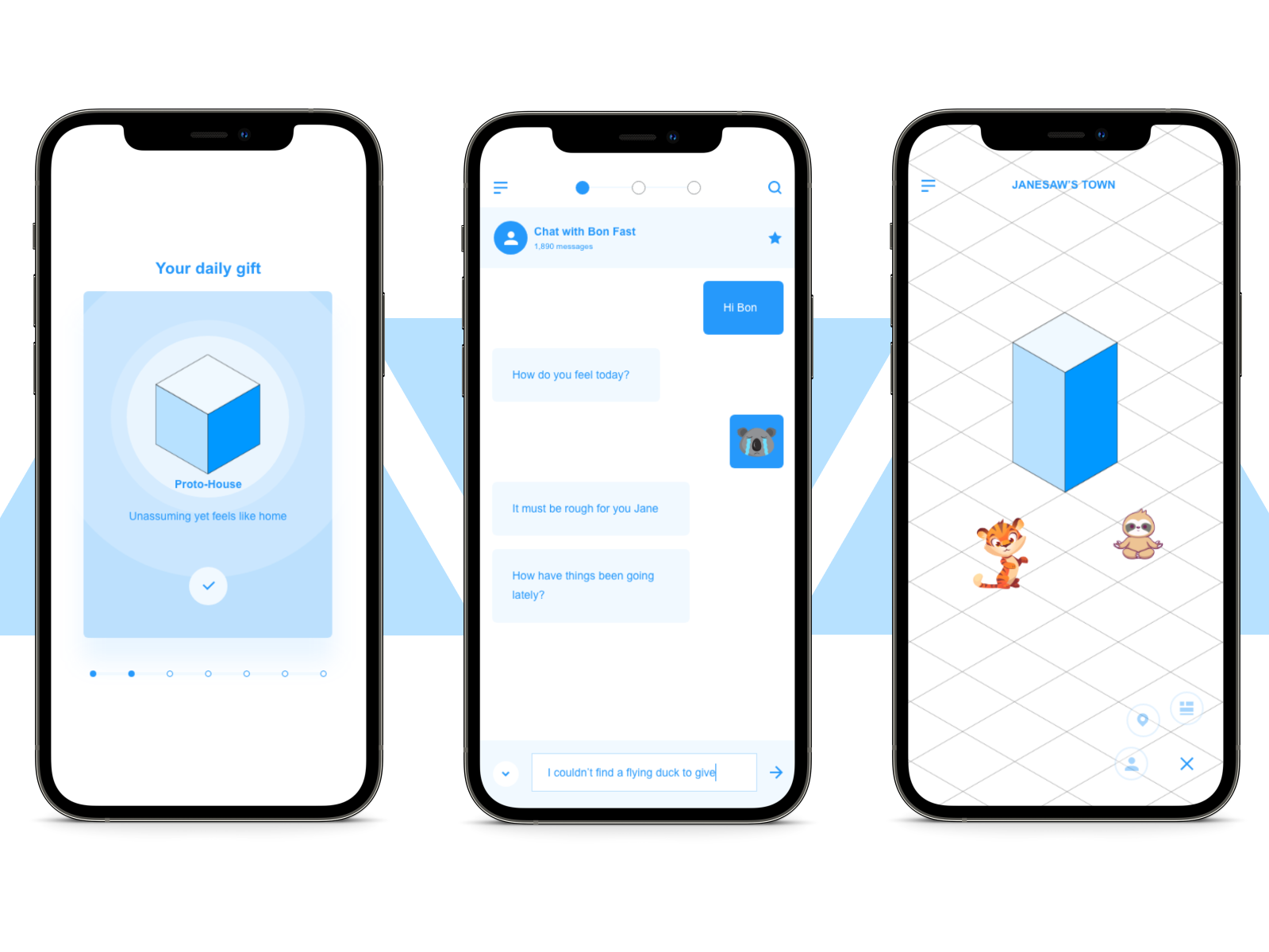
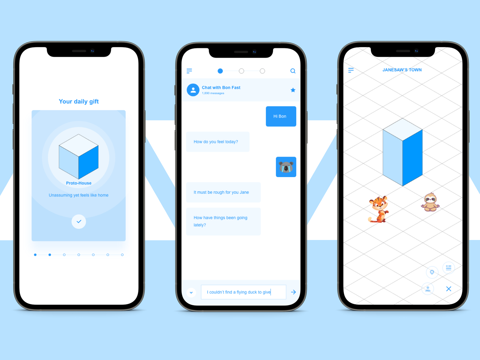
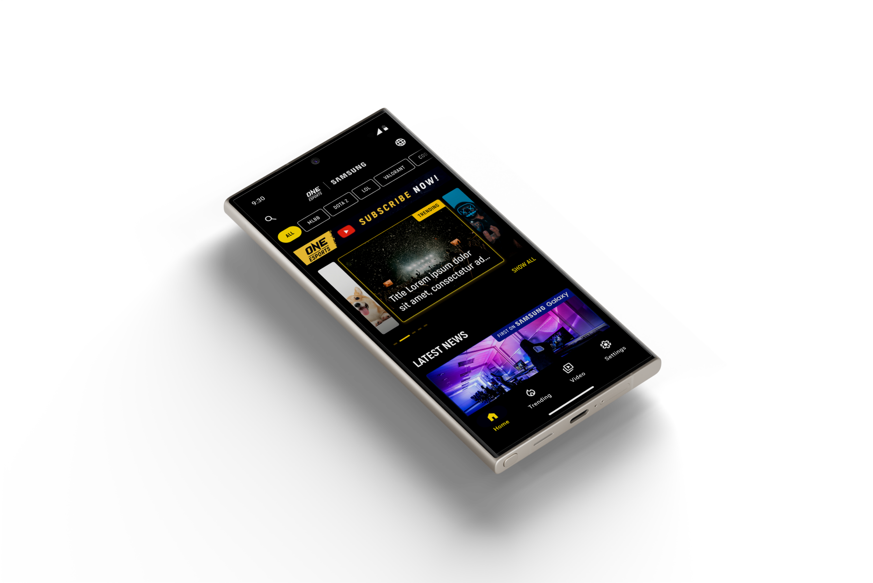
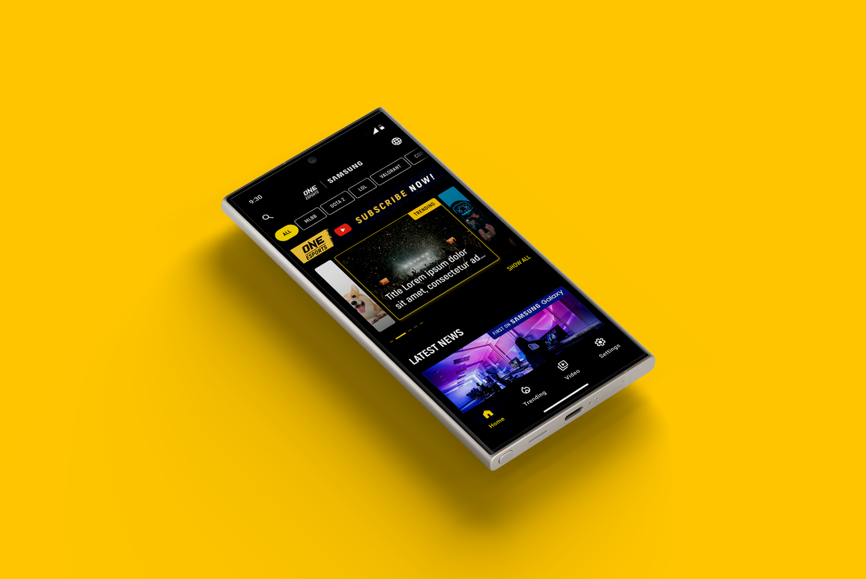
Mock + Hi-fi prototype
UI stuff -- to be updated --


Evaluation
Round 1
- The app needs to facilitate easy access to review information based on location.
- The app needs to integrate smoothly with existing systems and workflows to encourage high adoption rates.
- The app needs to facilitate easy access to review information based on location.
- The app needs to integrate smoothly with existing systems and workflows to encourage high adoption rates.
Round 2
- Automatic data analysis and highlighting of trends can significantly improve the user experience and efficiency.
- Automatic data analysis and highlighting of trends can significantly improve the user experience and efficiency.

Impact
The redesigned mobile interface has received overwhelmingly positive feedback during usability testing, with one participant stating, "The app is now so much easier to navigate, and I love how it gives me exactly what I need without clutter."
Accessibility considerations
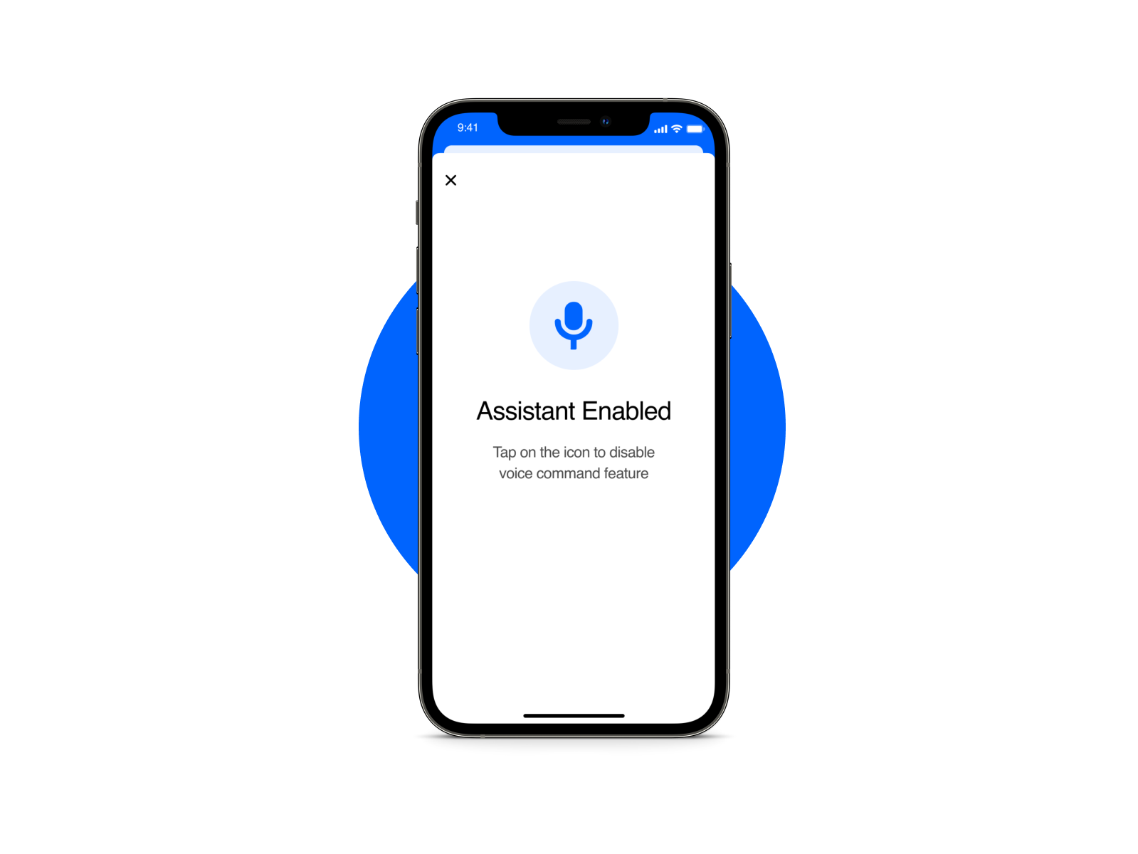
- VoiceOver and TalkBack Compatibility: Our design was rigorously tested for compatibility with mobile screen readers like Apple's VoiceOver and Android's TalkBack, ensuring that all elements are properly labeled and navigable
- Dynamic Text Resizing: We enabled dynamic text resizing throughout the app, allowing users to adjust the font size according to their preferences, thus making the app more accessible to users with vision impairments.
- Dynamic Text Resizing: We enabled dynamic text resizing throughout the app, allowing users to adjust the font size according to their preferences, thus making the app more accessible to users with vision impairments.
What I've learned
Throughout this project, I learned the importance of iterative design and how valuable user feedback is at every stage of the process. Furthermore, I realized the critical role of accessibility considerations in design, not just as an afterthought but as an integral part of the design process to make the app inclusive for all users.
What's next